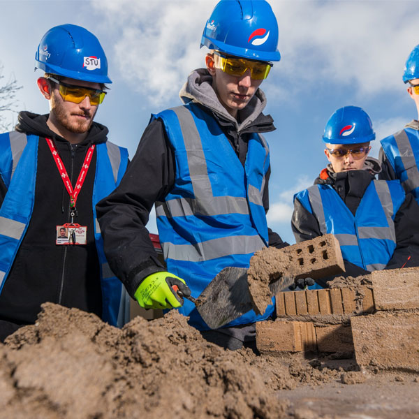
Bradfords Building Supplies is a trusted name in the UK construction industry, providing a comprehensive range of building materials and supplies for both trade professionals and DIY enthusiasts. With a rich history spanning over 250 years, Bradfords offers everything from timber and bricks to plumbing and electrical supplies. Their extensive product selection ensures that customers can find quality materials for any project, large or small. Committed to exceptional customer service, Bradfords’ knowledgeable staff are always on hand to provide expert advice and support. With multiple locations across the region, Bradfords Building Supplies remains a reliable partner for all construction needs.
Services provided for Bradfords...
The Result
Cape Creative begin by carrying out an in-depth research phase allowing us to get a true understanding of the target audiences, team members as well as their management process and structure. With this information, Cape began considering the visual elements of the identity as well as the application for the new logo.
Through the use of type, the final marque represents the strong, established nature of the business as well as by incorporating a striking colour palette it ensures that Brandfords stands out form the competition.
Sister Identities